
A landing page is a web page designed to get visitors to do just one thing: leave their information, send a WhatsApp message, book an appointment, or buy. It's where people land after clicking an ad, an email, or a social post.
The difference from your corporate website is focus. Your website presents the whole company and offers many paths. A landing page removes distractions and leads to a single action.
Landing page vs. website: key differences
| Aspect | Website | Landing page |
|---|---|---|
| Goal | Present the whole company. | Drive one specific action. |
| Navigation | A menu with many sections. | No menu, or a minimal one. |
| Audience | All kinds of visitors. | A specific campaign segment. |
| Content | Broad and varied. | Focused on one offer. |
| Measurement | Many metrics. | A clear conversion rate. |
What a landing page is for
- Ad campaigns: send traffic from Google Ads or Meta Ads to a page that talks about exactly what the ad promised.
- Launches: introduce a new product or service with all the information in one place.
- Lead generation: offer a guide, a consultation, or a quote in exchange for contact information.
- Events and registrations: sign up attendees for a seminar, trade show, or course.
- Audience segmentation: create different versions for each type of customer or city.
- Measure: know exactly how well each campaign performs.
Key point: Sending a paid campaign to your homepage is one of the costliest mistakes. Visitors arrive looking for something specific and find a menu of options.
Elements of a high-converting landing page
- A headline that matches the ad: if the ad says “Websites for restaurants,” the landing page should say the same.
- Subheadline with the benefit: what people get and how soon.
- A call to action visible right away: a button or form without having to scroll.
- Specific benefits: three to five, in the customer's own words.
- Trust signals: real reviews, case studies, client logos (with permission), and guarantees.
- Answers to objections: FAQs about timelines, process, and support.
- A second call to action at the end: for those who read the whole page.
What to remove
Full menus, social media links at the top, sliders, news blocks, and anything else that takes visitors off the page. Every exit is a paid click wasted.
Landing pages and WhatsApp in the US
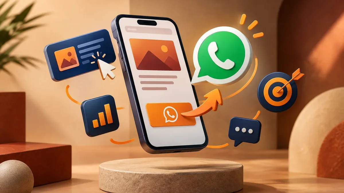
In our market, many people prefer sending a message to filling out a form. A good landing page offers both: a short form for those who want a call back and a WhatsApp button with a prefilled message that identifies the campaign. That way, your rep knows where the customer came from. If this format interests you, check out our guide to click-to-WhatsApp ads.
Speed: the factor nobody notices until it fails
A slow landing page wastes ad budget. Google Ads also factors in landing page experience when it evaluates the quality of your ads. A few recommendations:
- Images compressed in modern formats like WebP or AVIF.
- Few fonts and few external scripts.
- Fast hosting and an active SSL certificate.
- Real-world testing on mid-range phones over cellular data.
How to measure whether your landing page works
The main metric is conversion rate: out of every hundred visits, how many take the action you want. To measure it accurately:
- Set up the conversion in Google Analytics 4 and in the ad platform.
- Use UTM parameters on every link to know which campaign brought in each visit.
- Also track clicks to WhatsApp and to call as conversions.
- Test variations of the headline, image, or button, one at a time.
- Compare cost per customer, not just cost per click.
At PACOWEB, we design landing pages as well as landing pages for ad campaigns, with tracking connected from day one. And if you also need ad management, we can help with Google Ads for businesses.
How many landing pages do you need?
It depends on your campaigns. A rule of thumb: one landing page per offer and audience. If you advertise three different services, ideally you'll have three landing pages, each with its own message. You can start with one, measure, and grow from what works.
Common landing page mistakes
When we review campaigns that aren't delivering results, the problem is almost never just the ad. Often, it's the landing page. These are the most common mistakes:
- Mismatched message: the ad promises one thing and the page talks about another.
- Too many offers: a landing page with five services turns back into a homepage.
- Long form: asking for ten pieces of information for an initial quote scares most people away.
- No trust signals: visitors don't know your brand and have no reason to believe you.
- Weak button: “Submit” or “Learn more” doesn't tell people what they get.
- No polished mobile version: most clicks from social media come from phones.
- Nobody responds in time: a lead who waits two days has already talked to another company.
Fixing these issues often improves a campaign's results without increasing the budget. That's why we recommend reviewing your landing page before raising your ad spend. And if you want your entire site's design to follow this logic, learn about conversion-focused web design.
Planning to invest in advertising and want every click to count? Let's talk about a landing page designed for your campaign.
Talk to an advisor